Configure a PivotTable to Act like an External Data List
PivotTables are a great help
for analyzing a data set interactively. We can easily add in row headers
or columns headers or formulas and grouping to the data. Sometimes we
don’t need to do any of that clever stuff, though; we might want a
simple list of the data as it looks in the database. In Excel client, we
could of course achieve such a result by creating an External Data List
as opposed to a PivotTable. However, External Data Tables aren’t
supported in Excel Services, so we’re stuck trying to reign in the
analytical faculties of the PivotTable to produce a more sedate output.
To create a PivotTable that behaves in a similar manner to an External Data List, take the following steps:
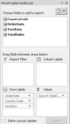
From
the PivotTable Field List, drag OrderDate, CountryCode, and Territory
into the Row Labels section. Drag Sum of TotalSales into the Values
section, as illustrated:
From
the PivotTable Tools tab, select the Design menu. In the Layout section
of the ribbon, select Report Layout | Show In Tabular Form. Again from
the Layout section, select Report Layout | Repeat All Item Labels. The
resulting PivotTable is starting to look a bit like a data list. We can
now remove the total rows by selecting Subtotals | Do Not Show
Subtotals from the Layouts section of the ribbon. To
remove the +/– buttons, open the Options menu from the PivotTable Tools
tab. Click the +/– button on the Show section of the ribbon to toggle
the buttons off.
Using Named Ranges in Excel Services
You may be wondering why
we had to go to the trouble of changing our PivotTable to a flat data
list. It’s fair to say that, generally speaking, we wouldn’t normally
need to take this step when using data in Excel Services, but this case
is a bit different. The TotalSales value retrieved from the database
represents the sales value in US dollars (USD). However, our
demonstration scenario requires us to be able to present this data using
a variety of currencies. So that we can convert this value to a
different currency, we need to use a formula, and formulas within
PivotTables are limited to include only data from within the PivotTable.
In our case, the exchange rate value that will be used by our formula
will be stored elsewhere in the workbook, so using a PivotTable formula
isn’t an option. We can achieve our desired outcome by flattening our
PivotTable and then adding appropriate formulae in adjacent cells.
Let’s move on to add a few named ranges that will be used on our calculation logic:
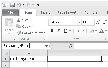
Navigate to Sheet2 in the Excel workbook. We’ll use this sheet to store the values required by our exchange rate calculation. In cell A1, type Exchange Rate. In the adjacent cell (B1), type the number 1. We’ll come back to this later when we create a UDF. With the cell B1 selected, in the Name box, enter ExchangeRate, as illustrated:
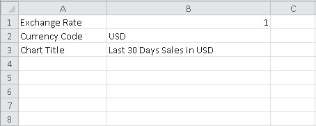
In cell A2, type Currency Code. In the adjacent cell (B2), type USD. With cell B2 selected, in the Name box, type CurrencyCode. In cell A3, type Chart Title. In the adjacent cell (B3), add the following formula: ="Last 30 Days Sales in " & CurrencyCode
When completed, the first few cells of Sheet2 should look like this:
Perform Calculations Using PivotTable Values
Now that we’ve defined the parameters for our exchange rate calculation, we can add the necessary formulae to Sheet1.
Switch back to Sheet1. In column E, cell E1, add header text SelectedCurrencyValue. In cell E2, add this formula: =GETPIVOTDATA("TotalSales",$A$1,"OrderDate",A2,"Territory",C2,"CountryCode",
B2)*ExchangeRate
This
formula extracts the value of the TotalSales column from the PivotTable,
where the OrderDate, Territory, and CountryCode columns match the
values contained in cells A2, C2, and B2. In plain English, the formula
returns the TotalSales value for the current row. Since
we want to perform this calculation for each row in the table, we need
to use this formula in every cell down to the bottom of the table. To do
this, type E2:E206 in the Name box, and then press CTRL-D.
Alternatively, we can manually select the cells in question and then
click Fill | Down from the Editing section of the Home ribbon. Note
Using formulae in this manner
requires special consideration when the PivotTable referenced will be
periodically refreshed. If, during a subsequent refresh, the PivotTable
ends up with a different number of rows, the formulae will not
automatically be filled down to accommodate the growth of the table. It
is important that you ensure that the size of the returned dataset
remains constant, and generally this can be done using Transact-SQL
(T-SQL) or by calling a stored procedure to produce the required data.
Since
we’ll use the data contained in the PivotTable and our calculated
column later, we’ll give it a name for ease of reference. Either
manually highlight the cells in the range A1:E206 or enter the range in
the Names box. Once the range is highlighted, type SourceDataTable. Sheet1 should now look like this: 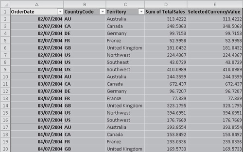
Add a PivotChart
Now
that we’ve created a data source that can be automatically refreshed by
Excel Services, we can move on to create a chart based on the source
data. We’ll render the chart on our web page to provide a graphical
representation of the sales data.
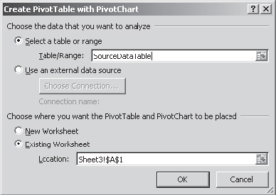
Select
Sheet3. We’ll use this sheet to contain the elements of our workbook
that will be rendered on our sample site. Choose Insert | PivotTable |
PivotChart. In the Create PivotTable with PivotChart dialog, type SourceDataTable as the Table/Range:
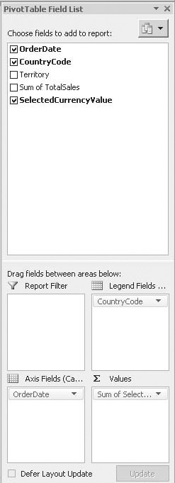
From
the PivotTable Field List, drag OrderDate into the Axis Fields section,
CountryCode into the Legend Fields section, and SelectedCurrencyValue
into the Values section. The field lists should look as shown:
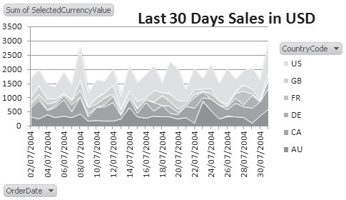
Our
chart is automatically generated based on our PivotTable data. However,
the default clustered bar chart type doesn’t make it easy to visualize
our data set, so let’s change this to something more appropriate. From
the Design menu, select the Change Chart Type button. In the Change
Chart Type dialog, select the Stacked Area chart type. To
add a title to our chart, select the Chart Title button from the Layout
menu. Since we want our chart title to be automatically generated based
on the currency code selected, we can add the following formula:
The PivotChart should look like this:
|